Liquid Metal Card
A card with an animated liquid metal shader effect.
This card uses bg-card so the liquid metal effect blends
naturally with its surroundings—dark on dark in dark mode, light on light in
light mode.
Create project
Deploy your new project in one-click.
Your new project will be created with the default settings. You can customize it later in the project settings.
import { Button } from '@/components/ui/button';
import {
  CardContent,
  CardDescription,
  CardFooter,
  CardHeader,
  CardTitle,
  LiquidMetalCard,
} from '@/components/ui/liquid-metal-card';

export function LiquidMetalCardDefault() {
  return (
    <LiquidMetalCard className='w-full max-w-sm'>
      <CardHeader>
        <CardTitle>Create project</CardTitle>
        <CardDescription>Deploy your new project in one-click.</CardDescription>
      </CardHeader>
      <CardContent>
        <p className='text-sm text-muted-foreground'>
          Your new project will be created with the default settings. You can
          customize it later in the project settings.
        </p>
      </CardContent>
      <CardFooter className='flex justify-between'>
        <Button variant='outline'>Cancel</Button>
        <Button>Deploy</Button>
      </CardFooter>
    </LiquidMetalCard>
  );
}
Installation
Usage
import {
LiquidMetalCard,
CardHeader,
CardTitle,
CardDescription,
CardContent,
CardFooter,
} from "@/components/ui/liquid-metal-card"<LiquidMetalCard>
<CardHeader>
<CardTitle>Card Title</CardTitle>
<CardDescription>Card Description</CardDescription>
</CardHeader>
<CardContent>
<p>Card Content</p>
</CardContent>
<CardFooter>
<p>Card Footer</p>
</CardFooter>
</LiquidMetalCard>Examples
Custom Effect
Notifications
You have 3 unread messages.
New
Customize the liquid metal effect with props like speed, repetition, softness, and color shifts.
import { Badge } from '@/components/ui/badge';
import { Button } from '@/components/ui/button';
import {
  CardAction,
  CardContent,
  CardDescription,
  CardFooter,
  CardHeader,
  CardTitle,
  LiquidMetalCard,
} from '@/components/ui/liquid-metal-card';

export function LiquidMetalCardCustom() {
  return (
    <LiquidMetalCard
      className='w-full max-w-sm'
      speed={1.2}
      repetition={6}
      softness={0.8}
      shiftRed={0.5}
      shiftBlue={0.1}
    >
      <CardHeader>
        <CardTitle>Notifications</CardTitle>
        <CardDescription>You have 3 unread messages.</CardDescription>
        <CardAction>
          <Badge variant='secondary'>New</Badge>
        </CardAction>
      </CardHeader>
      <CardContent>
        <p className='text-sm text-muted-foreground'>
          Customize the liquid metal effect with props like speed, repetition,
          softness, and color shifts.
        </p>
      </CardContent>
      <CardFooter>
        <Button className='w-full'>Mark all as read</Button>
      </CardFooter>
    </LiquidMetalCard>
  );
}
Player
The Summoning
Sleep Token · Take Me Back to Eden
2:15
6:46
import { Button } from '@/components/ui/button';
import {
CardContent,
CardDescription,
CardHeader,
CardTitle,
LiquidMetalCard,
} from '@/components/ui/liquid-metal-card';
import { Play, SkipBack, SkipForward } from 'lucide-react';
export function LiquidMetalCardPlayer() {
return (
<LiquidMetalCard
className='w-full max-w-sm'
speed={0.4}
repetition={3}
softness={0.4}
contour={0.3}
scale={10}
>
<CardHeader>
<img
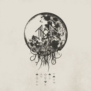
src='/images/take-me-back-to-eden.jpg'
alt='Take Me Back to Eden album cover'
className='mx-auto size-32 rounded-xl object-cover'
/>
</CardHeader>
<CardContent className='text-center'>
<CardTitle className='text-lg'>The Summoning</CardTitle>
<CardDescription>Sleep Token · Take Me Back to Eden</CardDescription>
<div className='mt-4 flex items-center justify-center gap-4'>
<Button variant='ghost' size='icon'>
<SkipBack className='size-5' />
</Button>
<Button size='icon-lg' className='rounded-full'>
<Play className='size-5 fill-current' />
</Button>
<Button variant='ghost' size='icon'>
<SkipForward className='size-5' />
</Button>
</div>
<div className='mt-4 flex items-center gap-2 text-xs text-muted-foreground'>
<span>2:15</span>
<div className='h-1 flex-1 rounded-full bg-muted'>
<div className='h-full w-1/3 rounded-full bg-primary' />
</div>
<span>6:46</span>
</div>
</CardContent>
</LiquidMetalCard>
);
}
Login
Welcome back
Sign in to your account
or continue with
import { Button } from '@/components/ui/button';
import { Input } from '@/components/ui/input';
import {
  CardContent,
  CardDescription,
  CardHeader,
  CardTitle,
  LiquidMetalCard,
} from '@/components/ui/liquid-metal-card';
import { User } from 'lucide-react';

import { Icons } from '@/components/icons';

export function LiquidMetalCardLogin() {
  return (
    <LiquidMetalCard
      className='w-full max-w-sm'
      speed={0.3}
      repetition={3}
      softness={0.8}
      shiftRed={0.2}
      shiftBlue={0.4}
    >
      <CardHeader className='text-center'>
        <CardTitle>Welcome back</CardTitle>
        <CardDescription>Sign in to your account</CardDescription>
      </CardHeader>
      <CardContent className='flex flex-col gap-4'>
        <Input type='email' placeholder='Email address' className='h-10' />
        <Input type='password' placeholder='Password' className='h-10' />
        <Button className='w-full'>Sign In</Button>
        <div className='relative'>
          <div className='absolute inset-0 flex items-center'>
            <div className='w-full border-t border-border' />
          </div>
          <div className='relative flex justify-center text-xs'>
            <span className='bg-card px-2 text-muted-foreground'>
              or continue with
            </span>
          </div>
        </div>
        <div className='grid grid-cols-2 gap-2'>
          <Button variant='outline' className='gap-2'>
            <Icons.gitHub className='size-4' />
            GitHub
          </Button>
          <Button variant='outline' className='gap-2'>
            <User className='size-4' />
            Google
          </Button>
        </div>
      </CardContent>
    </LiquidMetalCard>
  );
}